Who are we? The class of 2013
I was looking for an idea for an independent study project during my final year that would allow me to to some research and interviewing as well as improve in the area of typography and layout (especially in the area of data representation), when I landed on this idea of a Senior Infographic. It came to me for two main reasons:
First, I perpetually find myself trying to understand how people think and why they do the things they do. It was at a point in my senior year, where it was becoming increasingly important to function well as a group, and it was clear to me that some teams were doing it better than others. My experience has been that understanding your teammates is a fantastic way to begin communicating more effectively.
Secondarily, I felt that the information I garnered from my peers might be both interesting and helpful to the design department itself—and possibly the university—when looking at prospective students.
I compiled information about my classmates who where about to graduate in the spring from a survey I created and a Meyer Briggs personality test that I re-formatted into a PDF (you can take it yourself if you wish) that can be easily taken and self-scored with Adobe Reader (this helped eliminate errors in scoring). I had the intention of making this information into a responsive web page, but alas, my javascript skills are still a bit lacking for the scope of the project, so I've got these nifty graphics instead. I do, still hope to learn javascript and when I do, this will certainly be my first project!
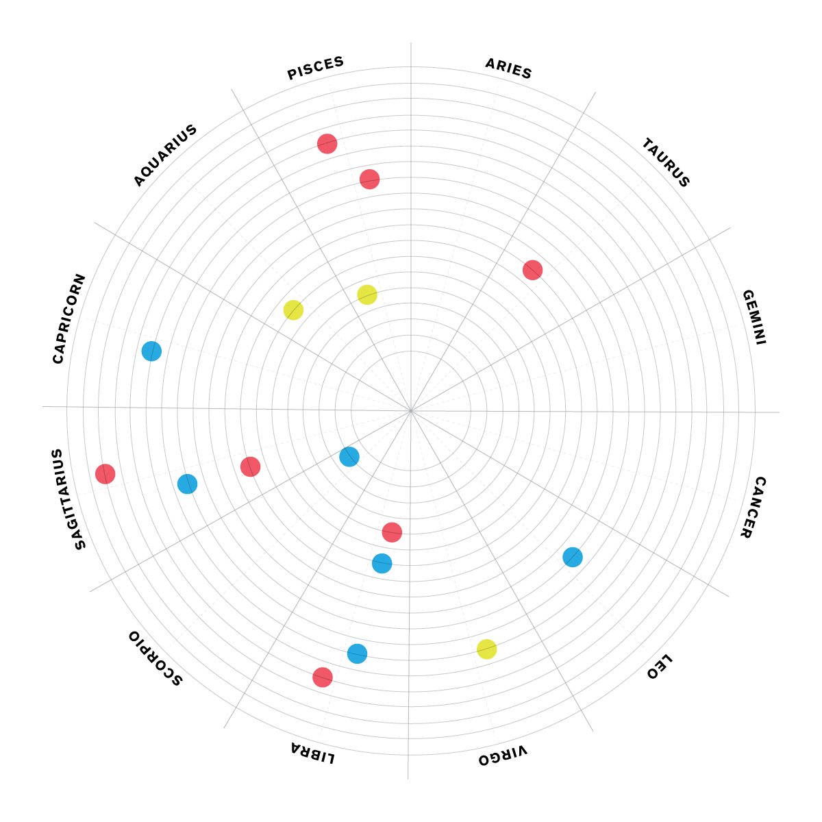
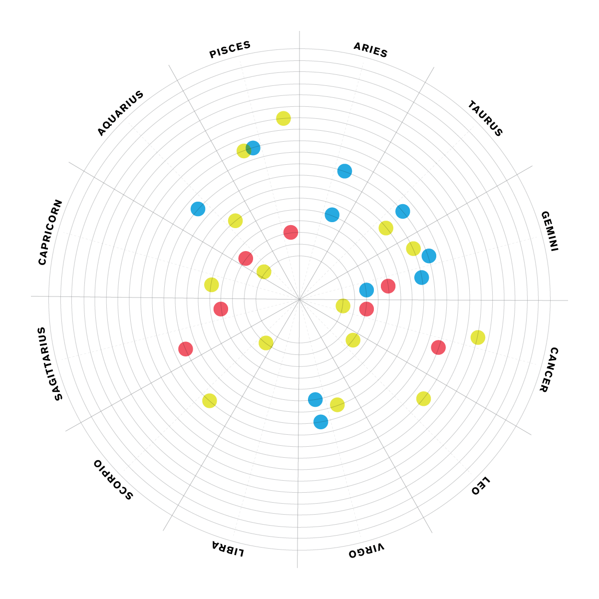
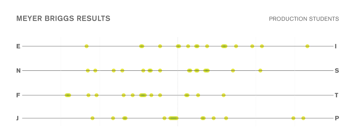
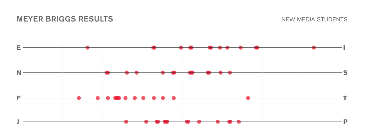
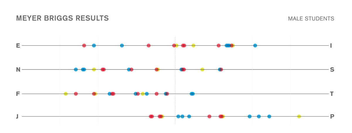
In each chart, Blue dots represent information for Graphic Design students, Yellow represents Production students and Red represents New Media Students.
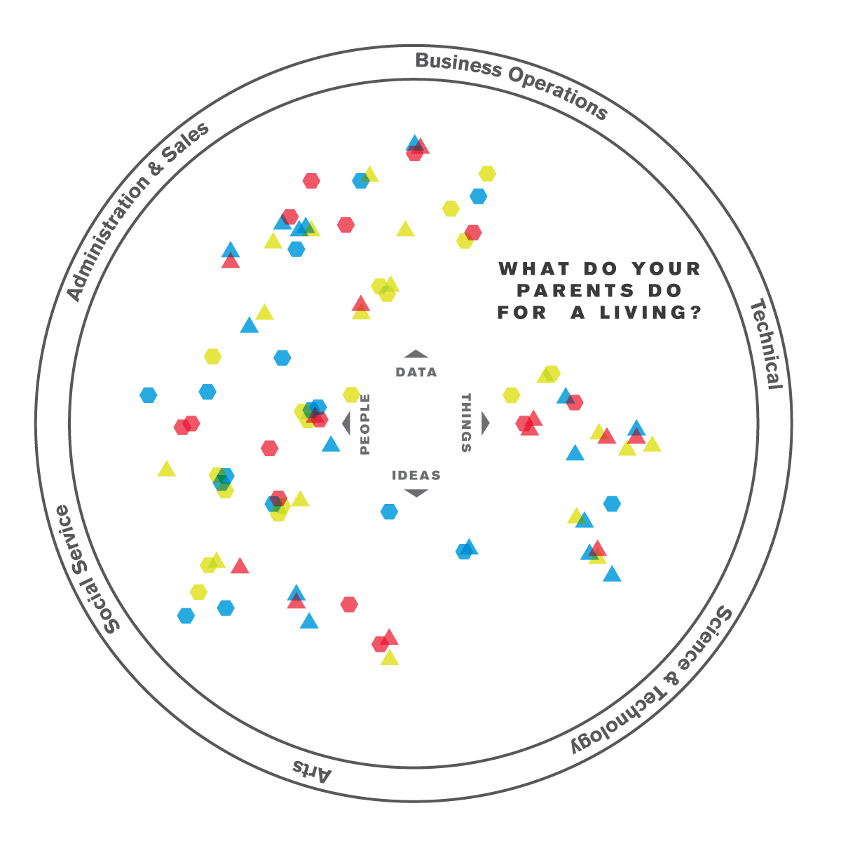
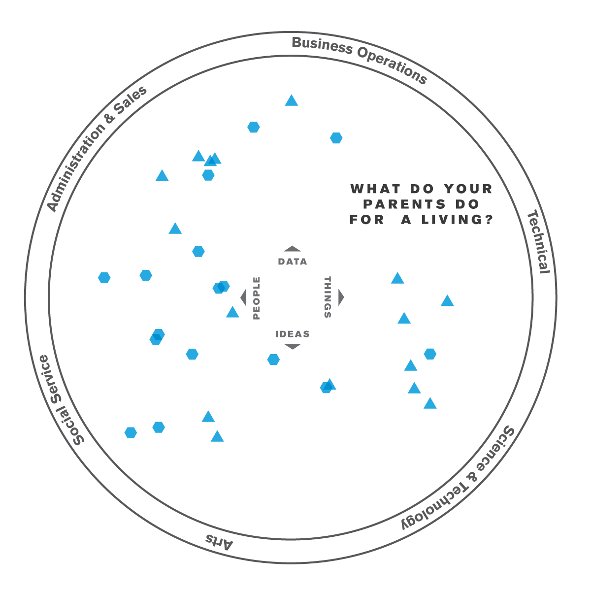
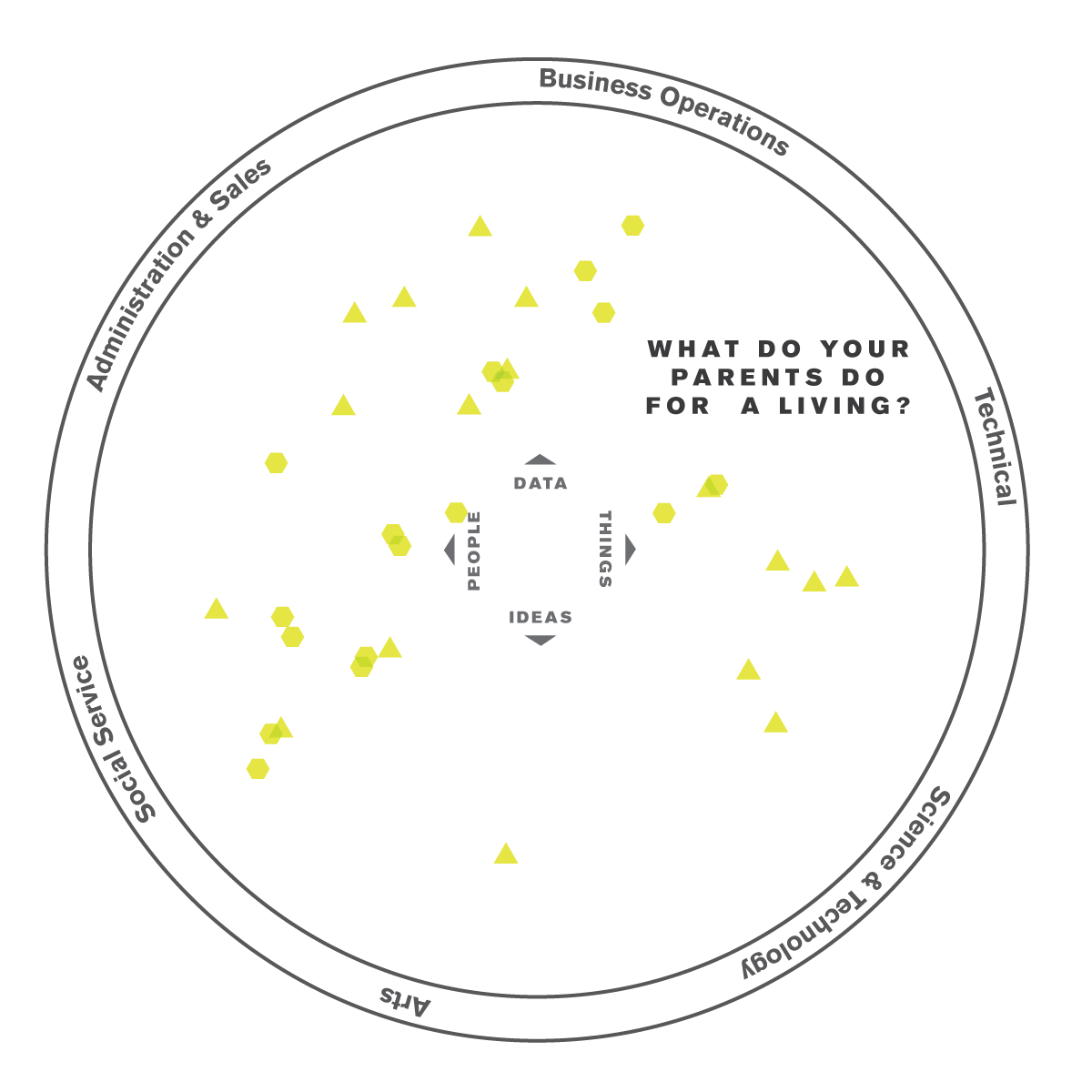
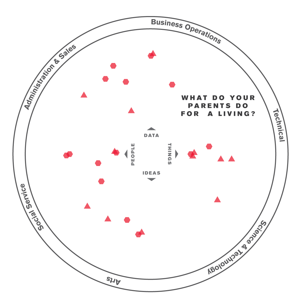

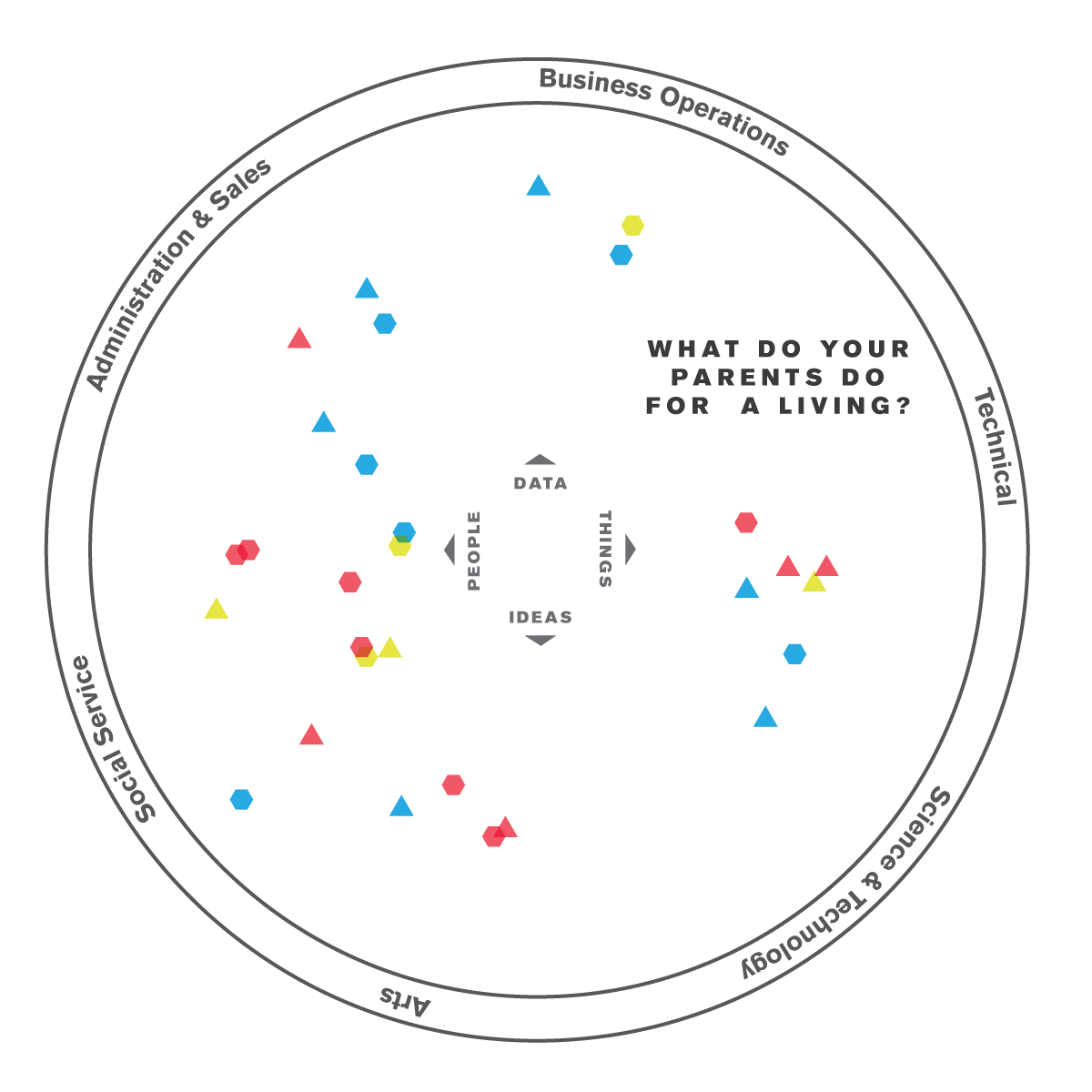
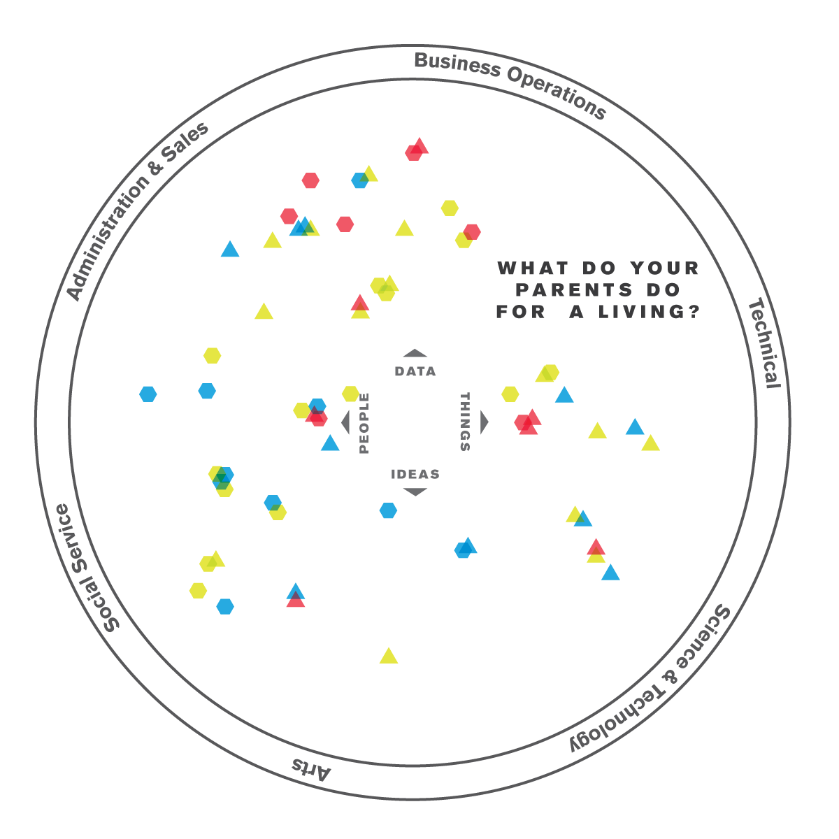
I started by looking to get a feel for what the background of each student was. With a brief description of what their parents do professionally, I was able to compile this nifty little chart. Hexagons represent their mother, Triangles, their father.
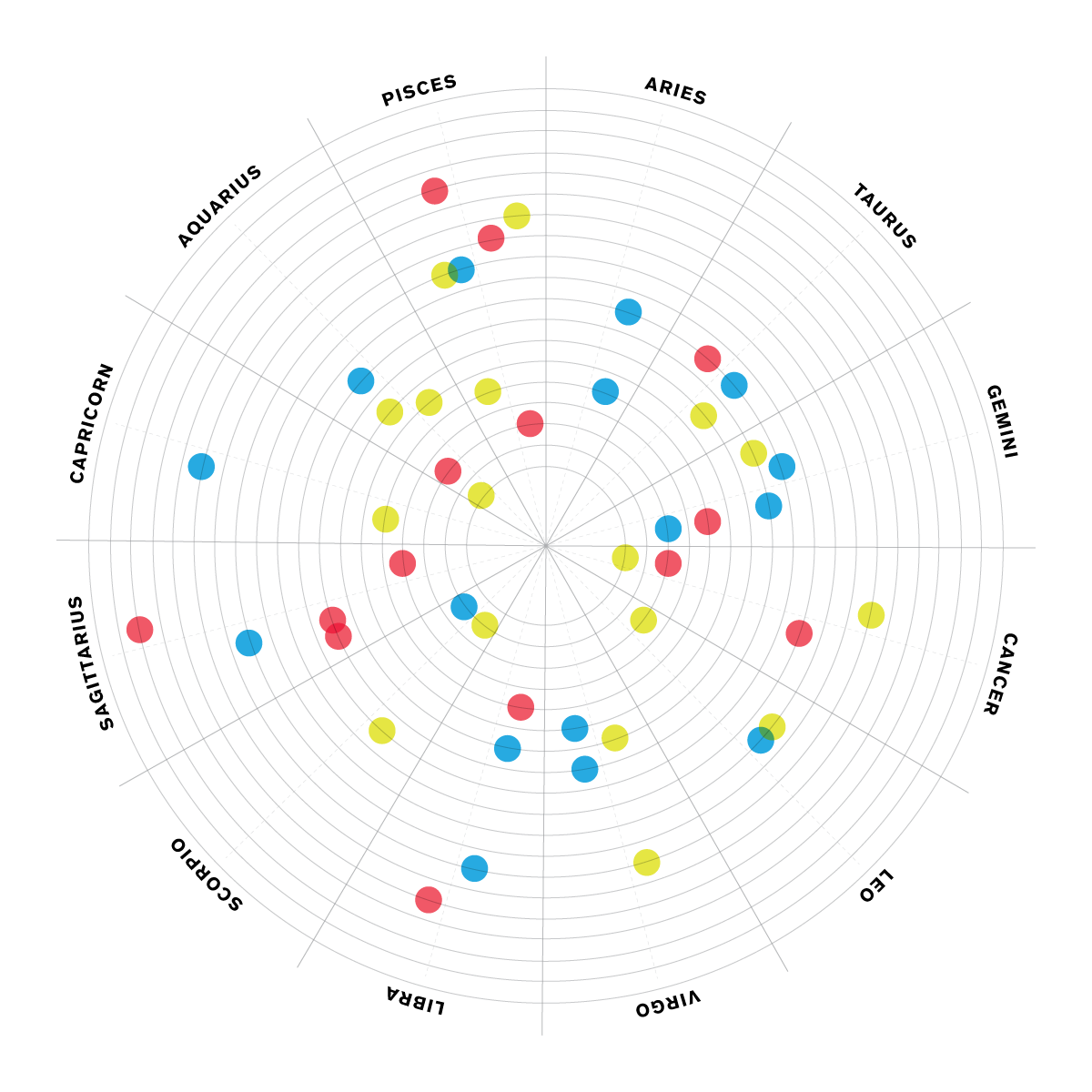
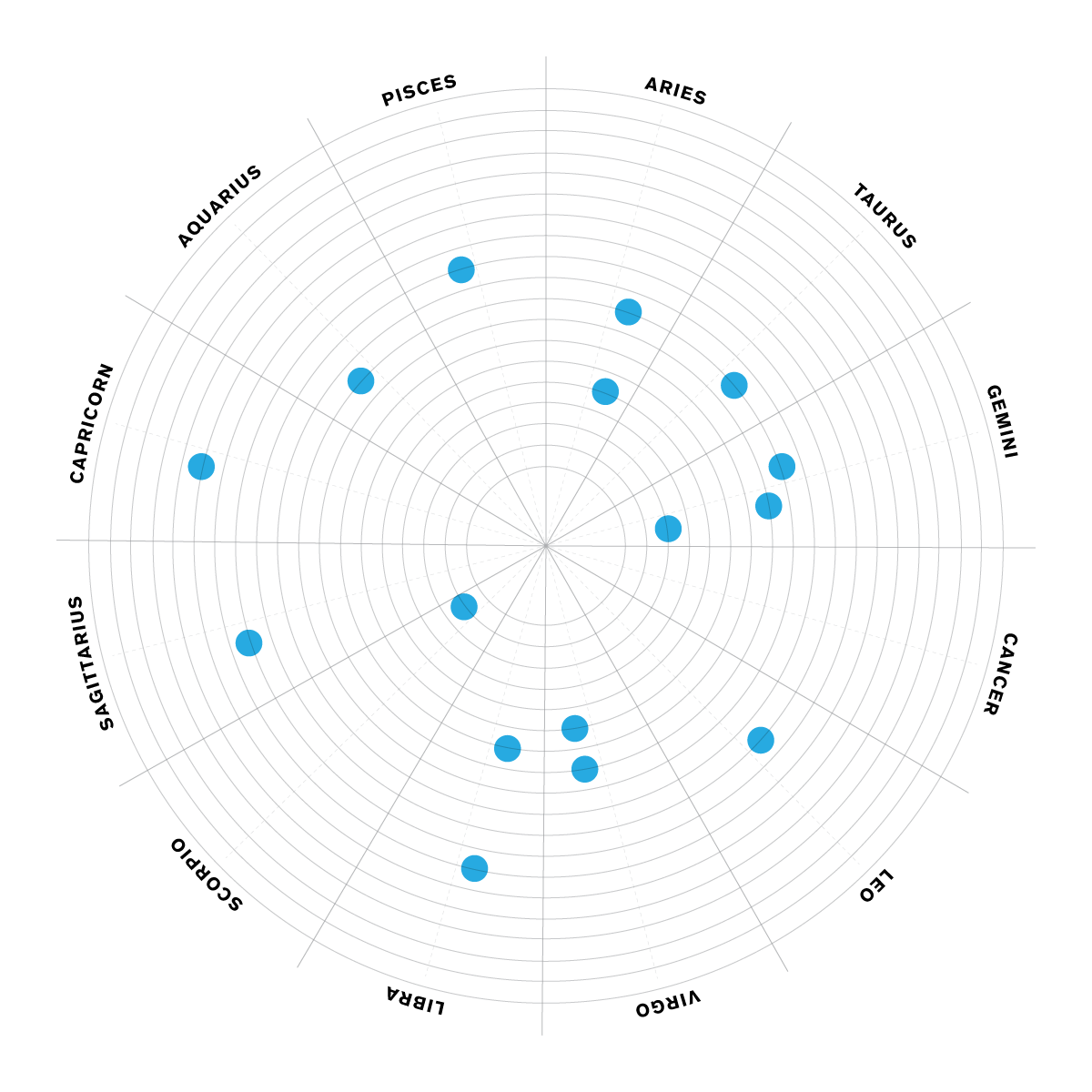
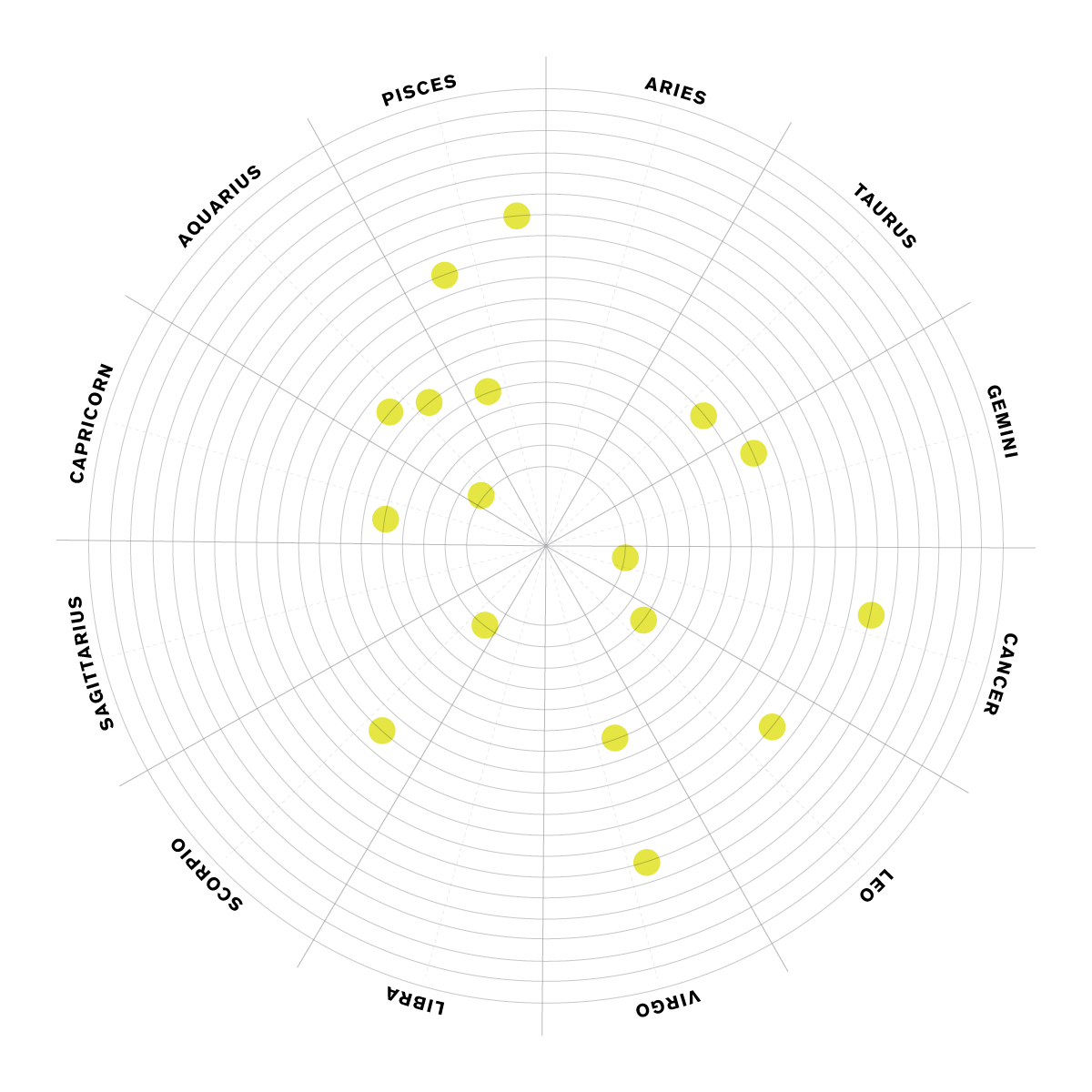
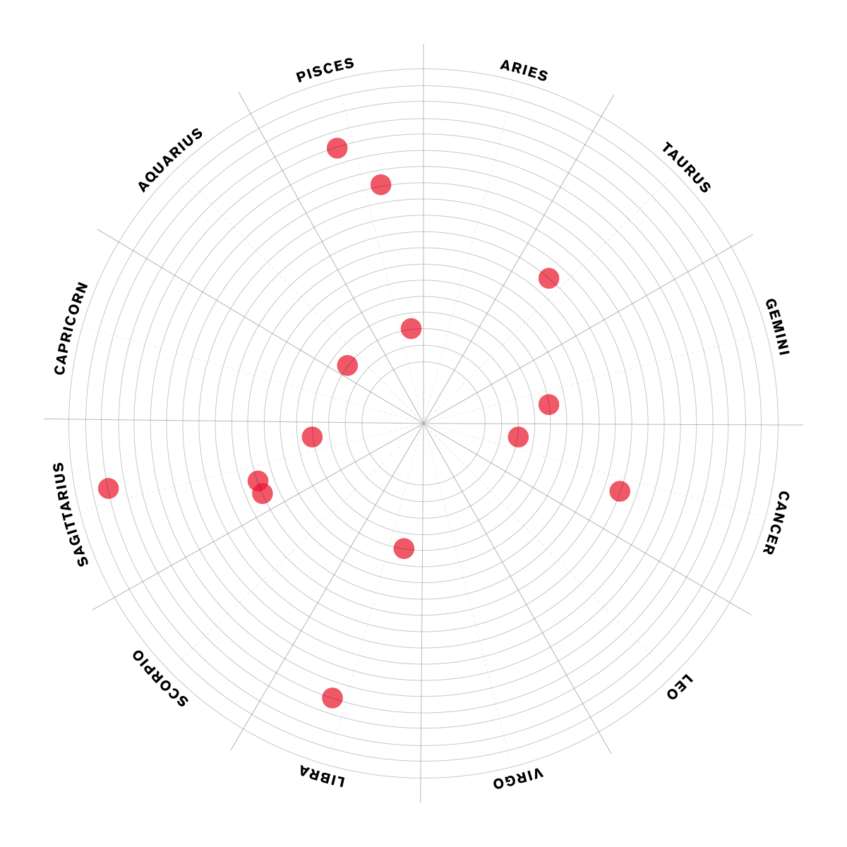

I don't personally set much stock in horoscopes, but I love birthdays and this seemed like the best way to view them. The clearest take away is the shift between men and women, with women generally appearing much closer to the beginning of their sign (towards the center), and men being generally later (further out).
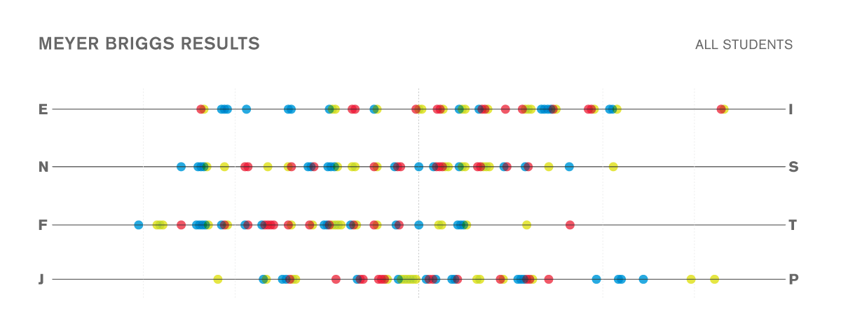


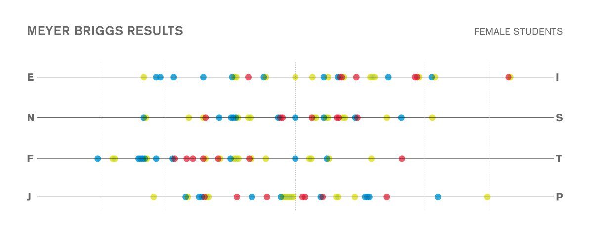
I've always been fascinated with the Meyers Briggs classification system. I think the most common misinterpretation of this data is that you are one thing or another, when really, each person falls on a spectrum between the two points. I, for instance, fall in just extraverted of center (meaning that I have many introverted tendencies as well), and dead center in Intuition and Sensing. This chart helps people understand that better than just reading a category.
Interesting observations: Production has the widest spread (range) of characteristics of the concentrations, while New Media seems to be the most clustered. Graphic is split pretty fairly on all categories except on how they make decisions—they certainly seem to prefer feeling to thinking. Graphic Design is also more extroverted. Only 3 students fell into the "extreme" ranges of personalities: one in each concentration, with the production person in two categories.
Median points on the graphs seems to suggest that as a whole, our design class is slightly introverted, slightly intuitive (we experience the world best through concepts and don't always need tangible explanations to understand it), highly feelings oriented (making decisions based on emotions over cold logic an rational), and nearly dead center on Judging (finding deadlines motivating) and Perceptive (always feeling like we could do better with just a bit more research and time) which seems about right.

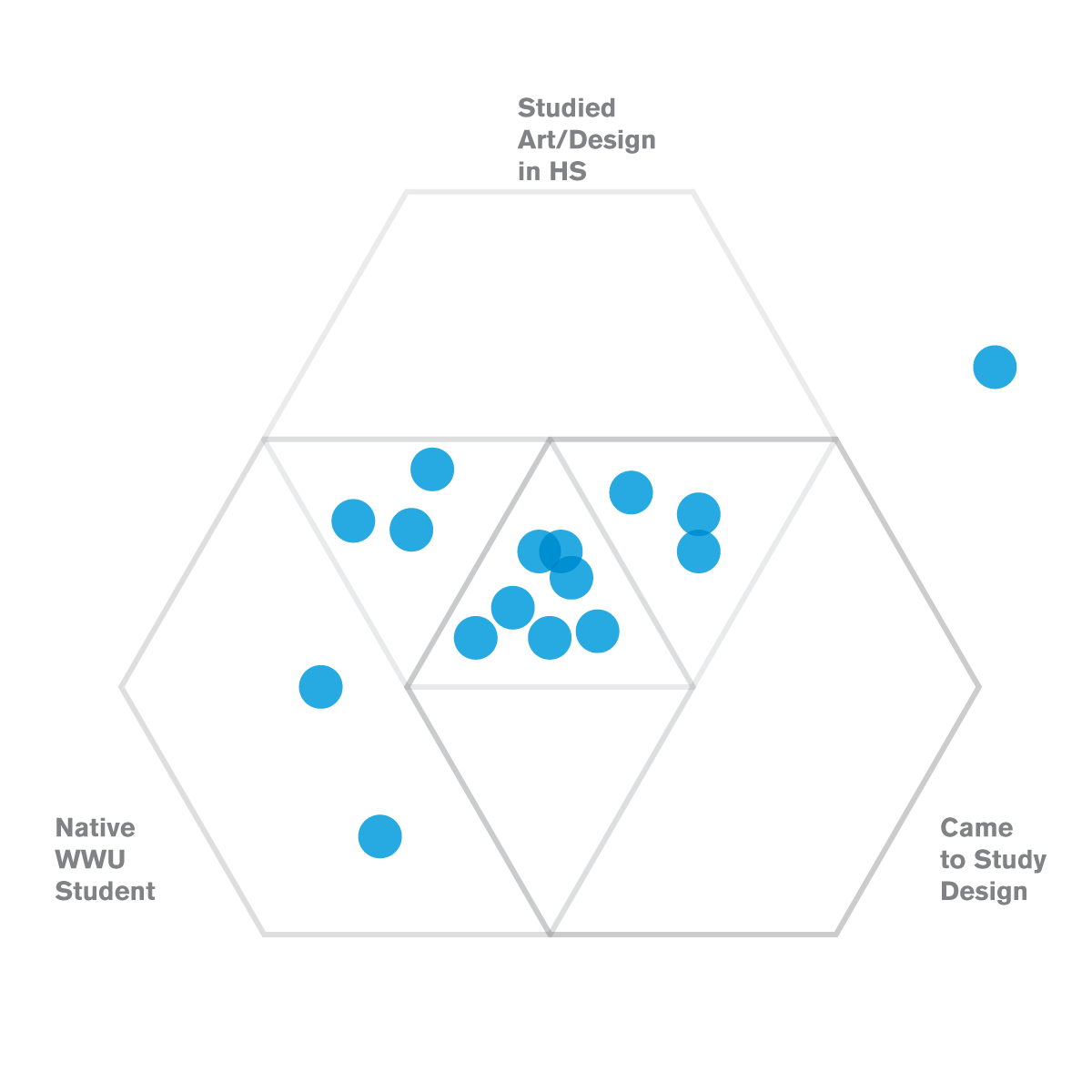
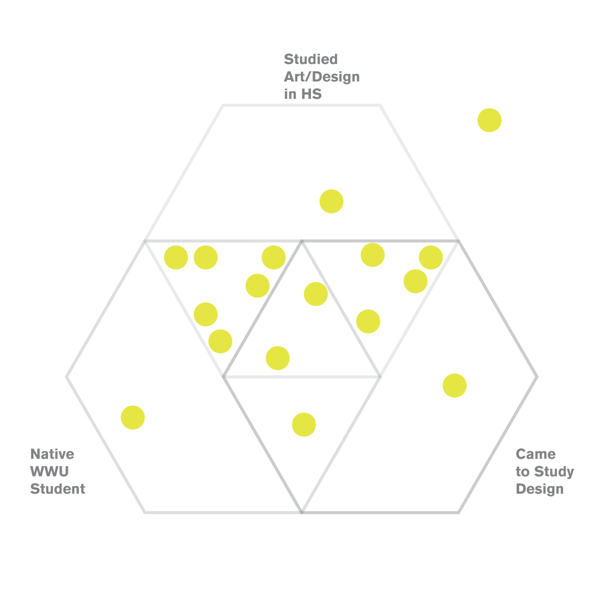

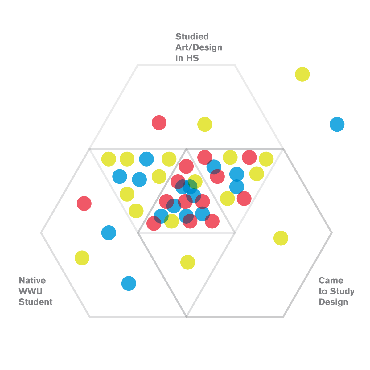
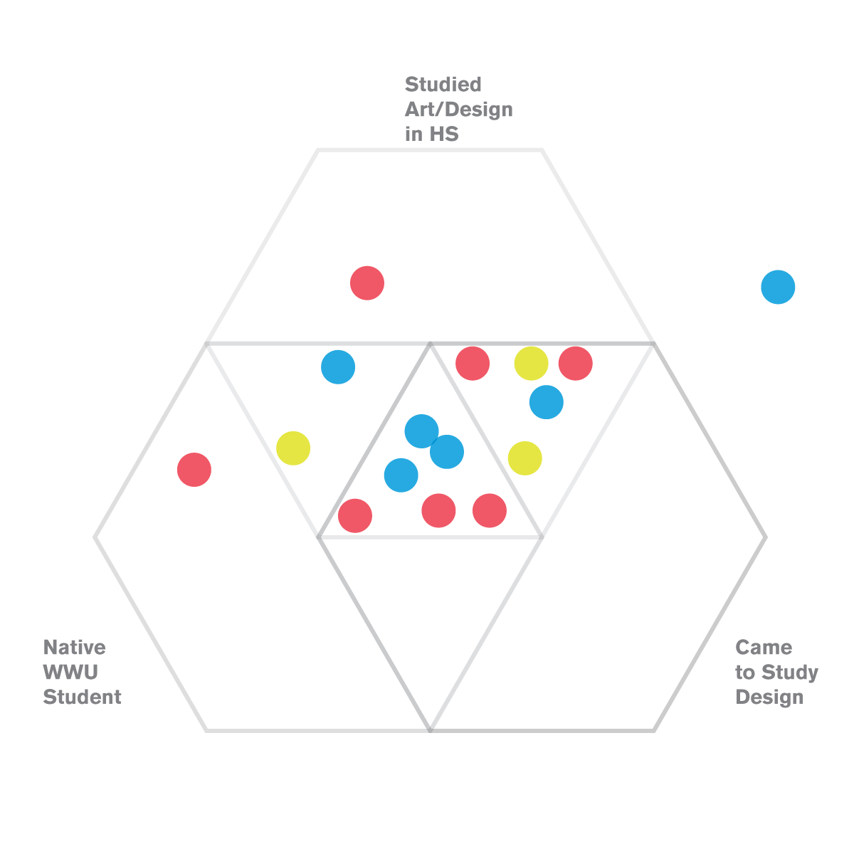
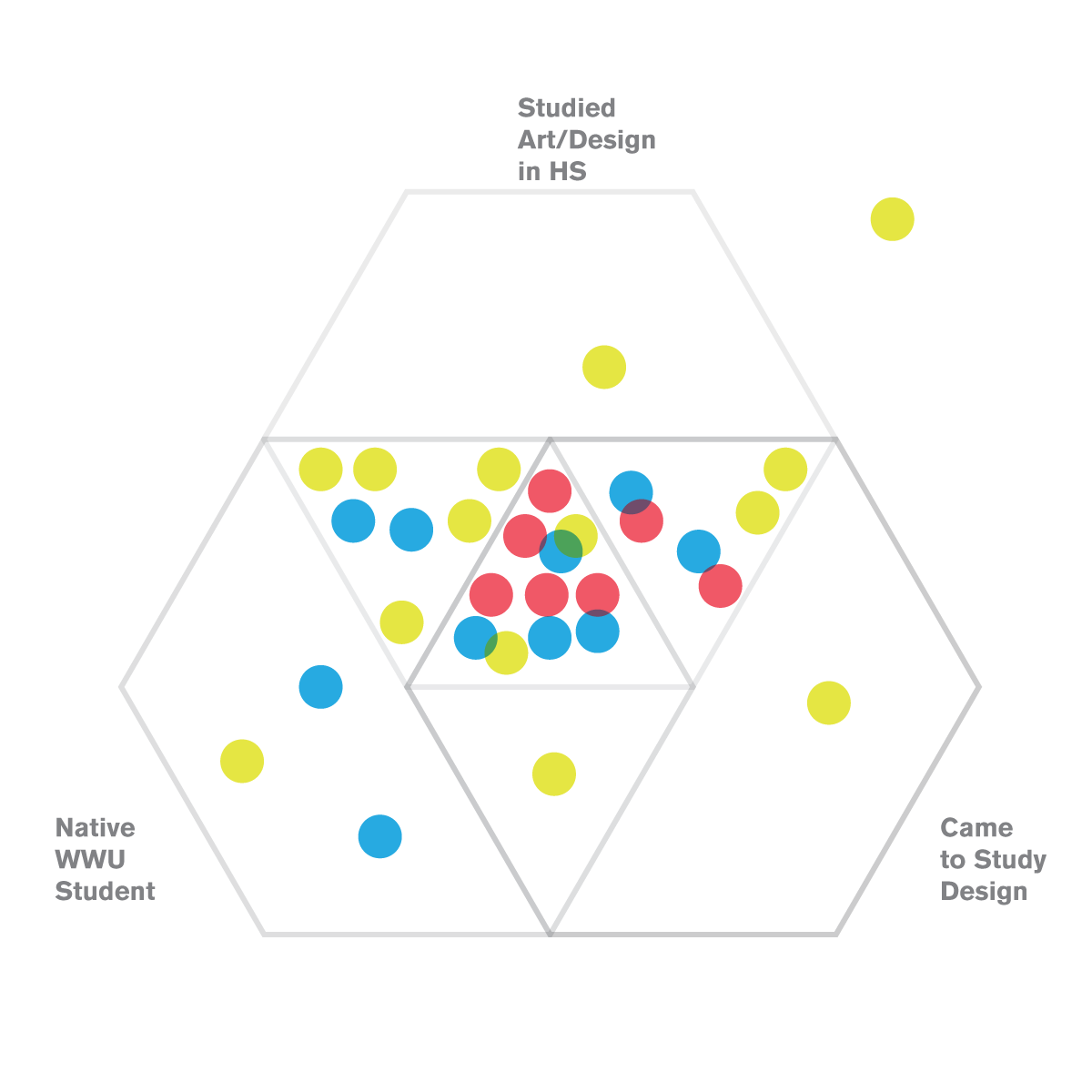
I was also curious to see what kind of background experience people had before going out into the professional world of design. Those within the top Hexagon studied art or design in high school (81%), where as anyone outside of it had their first educational experience of the topic elsewhere. We can assume that any person falling outside of the lower left hexagon was a transfer student (34%), and 63% of us came to Western specifically for the design program.
I have many more interesting data points, that I hope to one day turn into an interactive chart that can be filtered by concentration, gender, dominant hand, and age during university.